
Bartly
A barter market that stays generous on the side that supplies it.
- Product
- B2B barter marketplace for brands and creators
- Market
- Worldwide
- Surface
- iOS
- My role
- Product design, UX, brand identity
Context
Bartly runs on barter rather than invoices. A business - a restaurant, a venue, a cosmetics brand - places an event or an offer, and a creator takes it in exchange for coverage. No rate card, no purchase order, no finance department in the middle.
A barter market fails on whichever side runs dry
Marketplaces of this kind default to filters. Category, location, follower count, engagement rate - each a legitimate signal, and together a form that has to be completed before anything useful appears. The product asks a creator for precision before they know what they are looking for, and the feed looks empty until they get it right.
The business side has the opposite failure. A brand placing an event needs to believe the reach is real, so the interface fills with numbers, and the numbers arrive without a frame that says which of them matter for this particular collaboration.
The two sides also speak differently. A brand thinks in campaigns, budget equivalent and return. A creator thinks in what kind of work is this, does it suit me, and is it worth the trip. One product has to hold both without either feeling like a guest.
Abundance for creators, evidence for brands
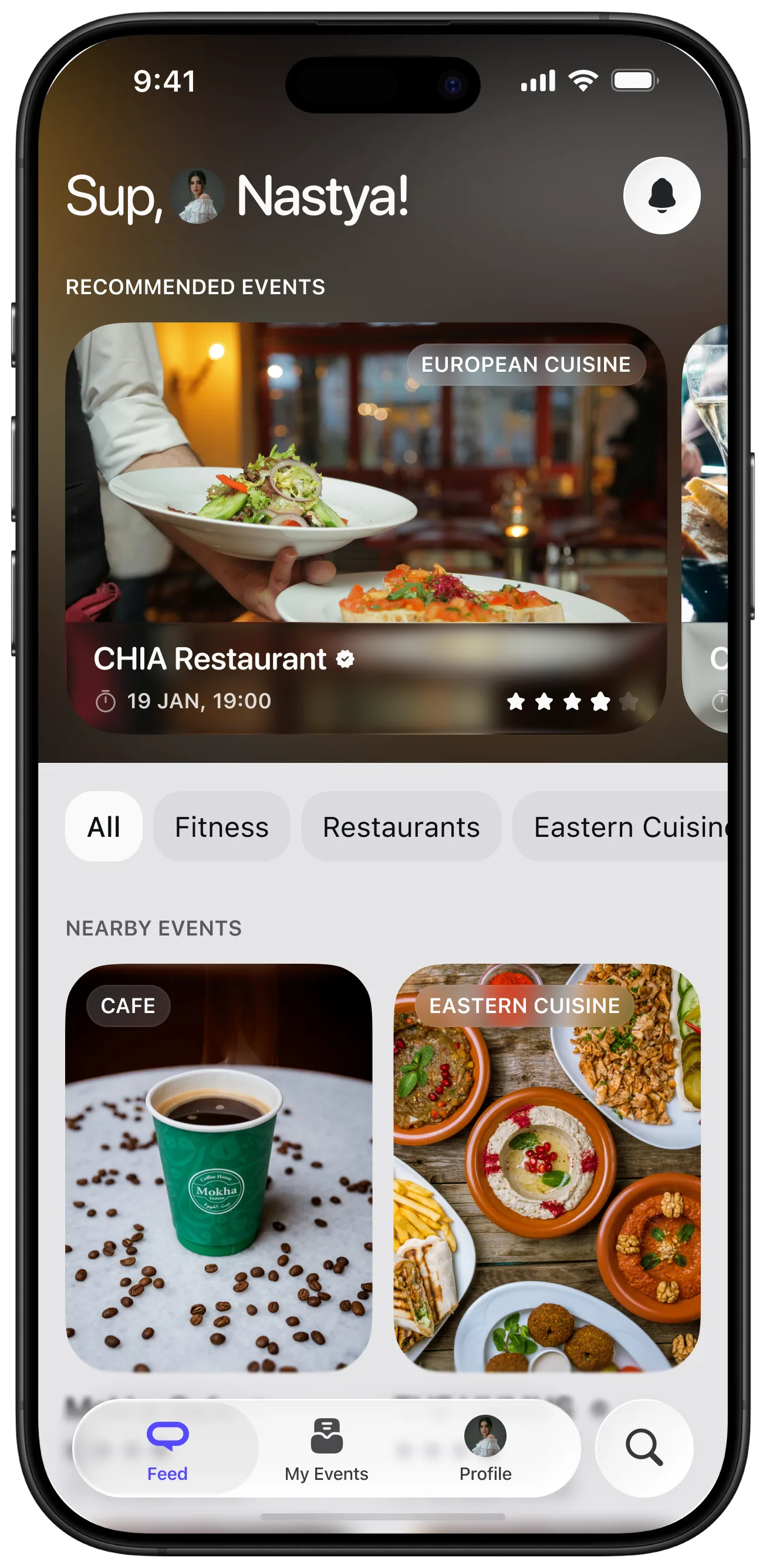
Discovery opens with recommendations, never with an empty search field. Something concrete is on screen immediately - a venue, a date, a category - so the first interaction is a reaction rather than a query. Filters stay available, but as a way to narrow what is already visible instead of a gate in front of it.
Interests do the work a signup form would otherwise do. Categories a creator engages with become the ordering principle, so the feed sharpens with use and the product earns the right to ask for detail later.
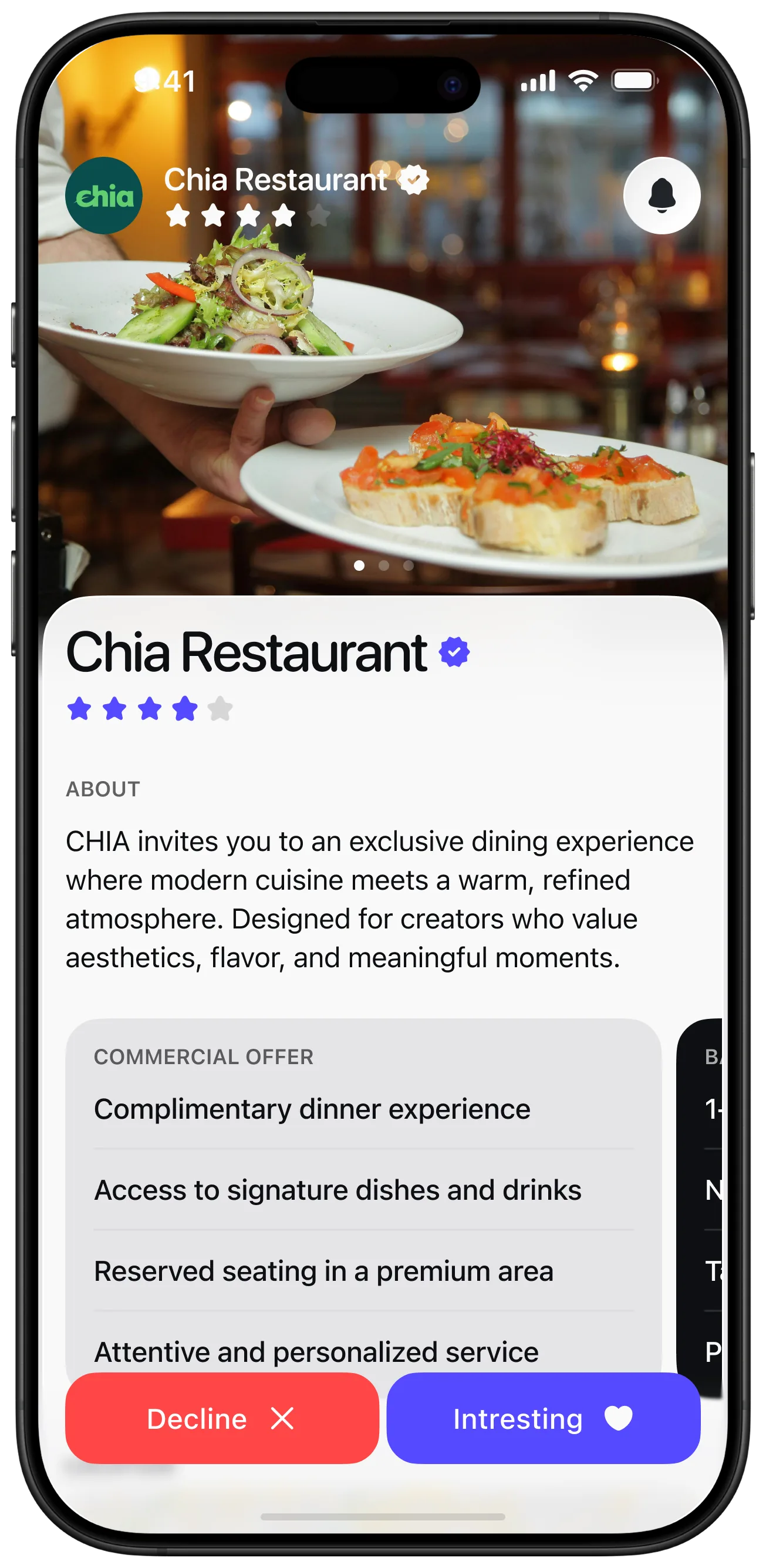
An offer is designed as a decision, not a thread. Terms, what is included, what is expected in return, and the two actions - decline or express interest - all sit on one screen, because a barter deal that takes three messages to understand will not get taken.
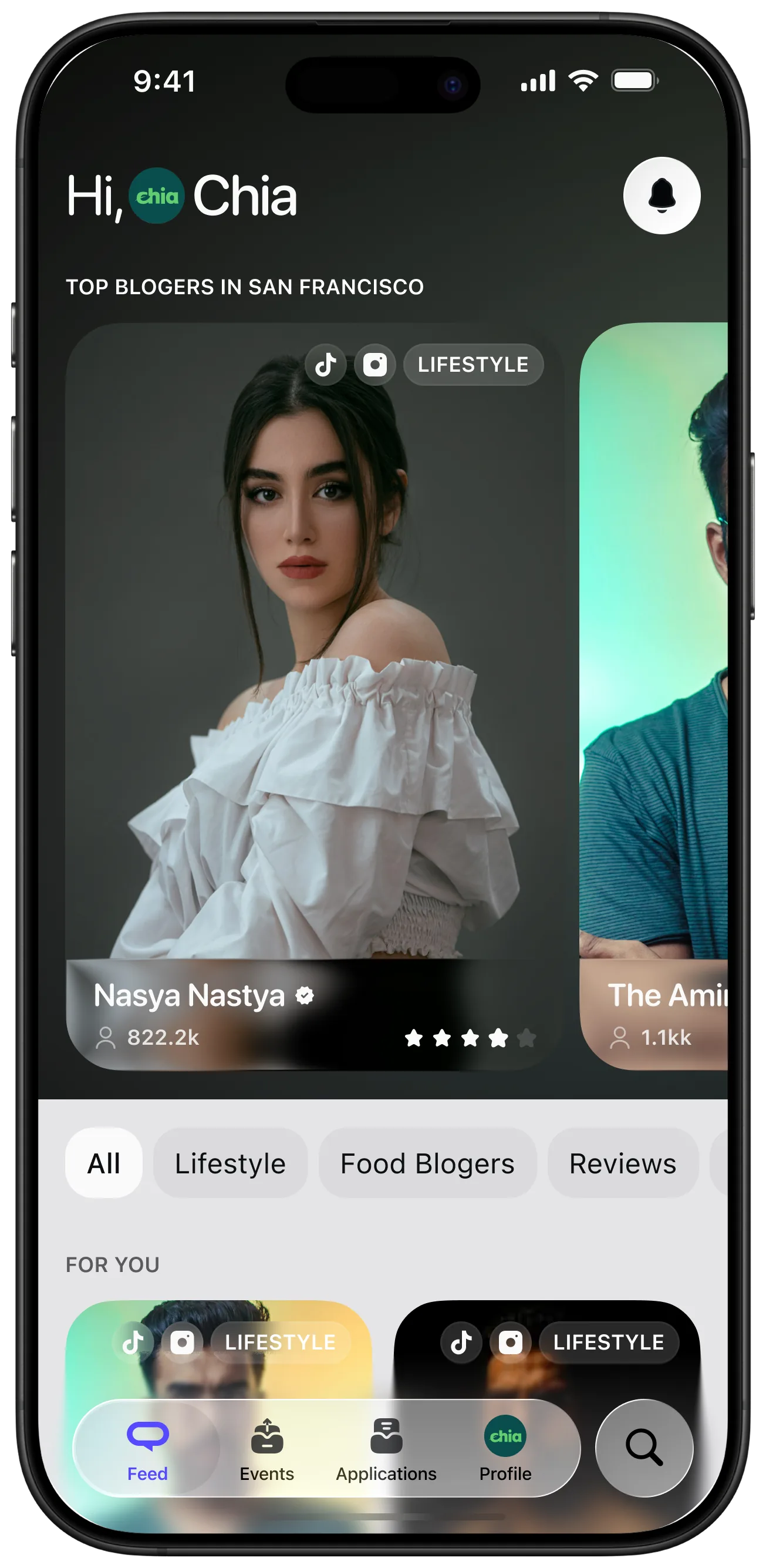
On the business side the same components carry different weight. Creator search leads with the people, with supporting numbers in fixed positions so comparison is a glance rather than an exercise. The monetisation lives here, so this is the surface that has to feel like control.
My approach
Define the match, not the filters
Establish what actually makes a brand and a creator a good fit, and let that decide which signals the interface leads with.
Open with supply
Design the creator's first screen to present concrete offers immediately, so the market never looks empty on arrival.
Let interest replace the form
Use engaged-with categories to order the feed, so the product sharpens with use instead of demanding setup.
Make an offer decidable in one screen
Put terms, expectations and the two possible answers together, because a barter deal has no invoice to fall back on.
Carry one identity across both sides
Build a visual system flexible enough to hold the creator feed and the brand console without either reading as an afterthought.
One product for two very different reasons to be here
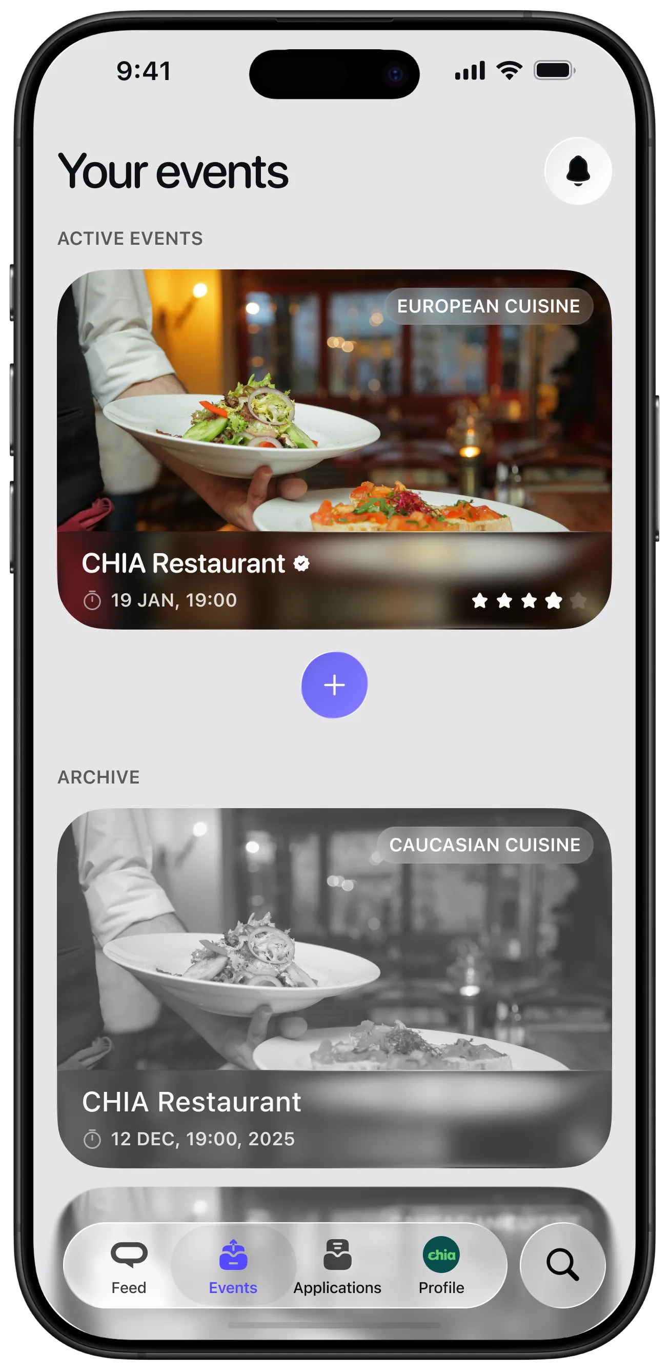
A creator gets something worth reacting to in the first seconds, and a brand gets a decision rather than a spreadsheet. Both run on the same components and the same visual language, so the platform reads as one product with two entrances.
Tilting the monetisation toward the business side let the creator experience stay generous. Supply is the thing a barter market cannot fake, so the side that produces it should not also be the side being charged.
How I arrive at what makes a match is in nobody hires a persona: the useful unit is the situation, not the demographic. Holding both sides in one component set is the argument in a design system is a decision system, and Gettran is the other marketplace here where the tooling wanted to eat the thing being traded.
- Barter model with monetisation weighted to the business side
- Discovery opens with real offers rather than an empty search
- Interests order the feed, so the product needs no setup form
- An offer resolves in one screen: terms, expectations, decision
Reflection
Two-sided products fail at whichever side you designed second. Keeping both flows in one component system was less about efficiency and more about refusing to let the creator side become the cheap one.