
Gettran
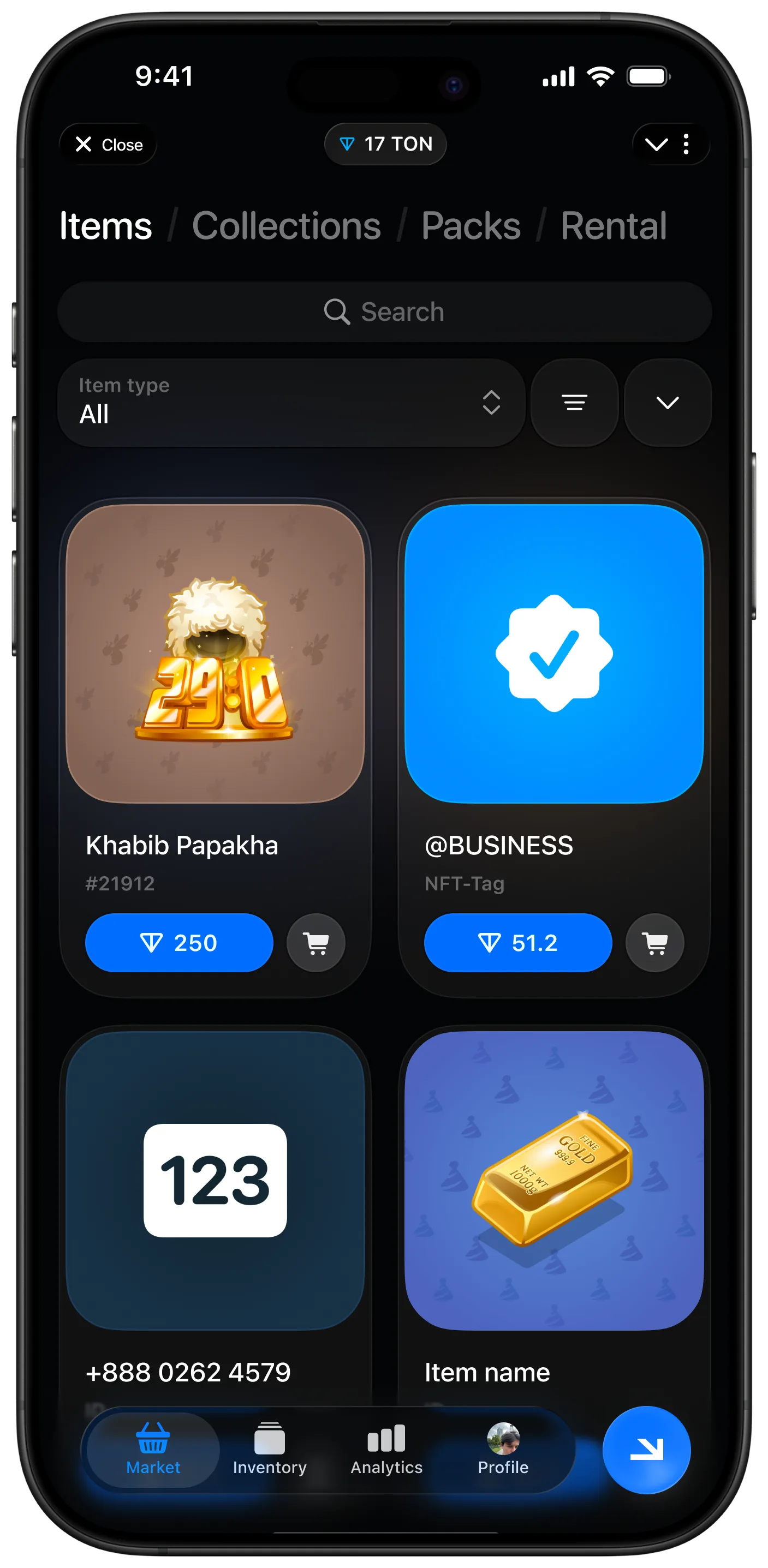
Making the gift the brightest thing on every screen.
- Product
- Telegram marketplace for gifts and digital assets
- Surface
- Telegram mini app
- Focus
- P2P trading, market analytics, ambient light interface
- My role
- Product design, UX, interaction, visual system
Context
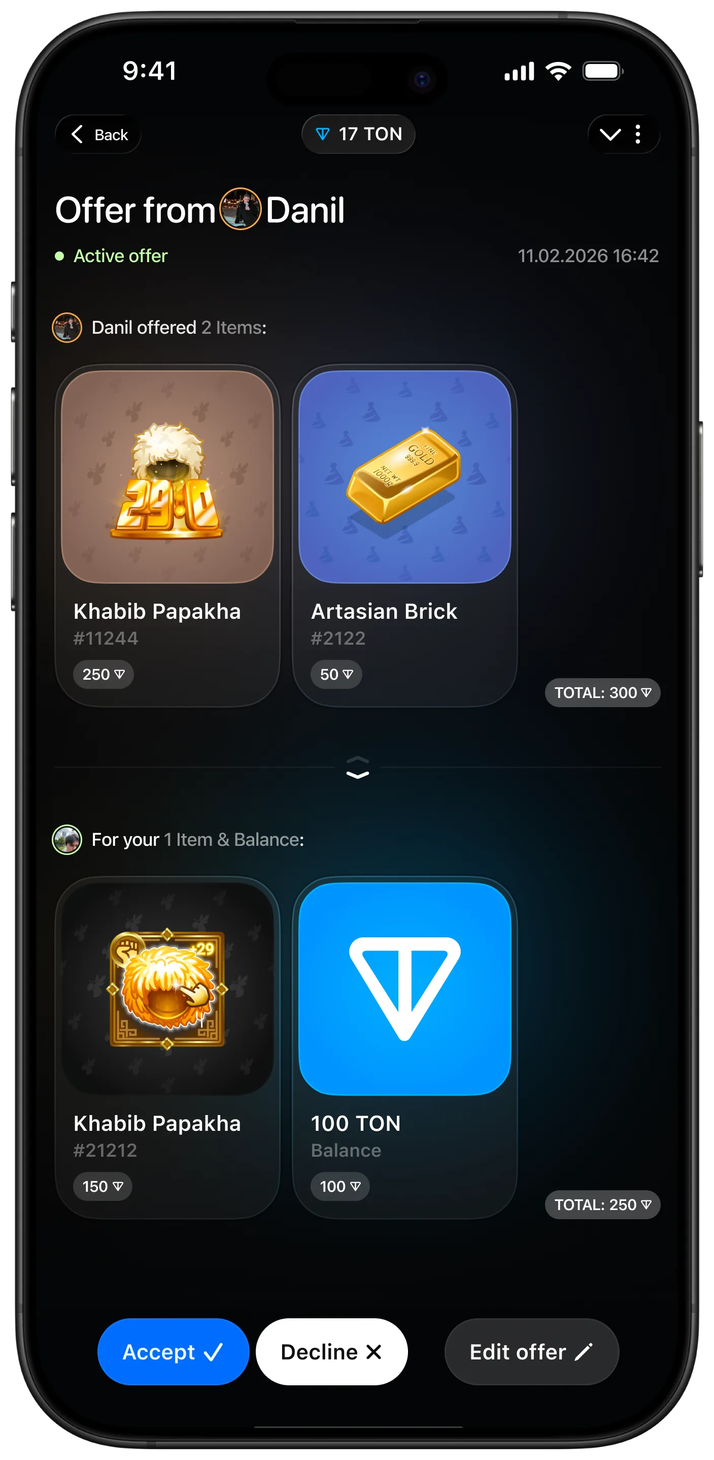
Gettran is a marketplace for Telegram gifts and digital assets, with a peer-to-peer trade layer on top. People browse and buy, but the part that keeps them is trading: offers built the way Steam built them, where two sides assemble a bundle and agree to it, rather than posting listings and waiting.
The tooling wants to eat the thing being traded
Every marketplace with real trading in it drifts the same way. Filters, order history, floor charts, volume, offer state, escrow status - each one earns its place, and together they turn the product into a dashboard where the item itself becomes a thumbnail.
For Gettran that is fatal, because the items are collectible gifts. People are here because a particular gift looks good and carries status. If the interface reduces it to a row in a table, it has removed the reason anyone showed up.
The second constraint is the surface. A Telegram mini app opens inside a conversation, so there is no onboarding budget and no room for a navigation system that has to be learned before it can be used.
Ambient light: the interface takes its cue from the gift
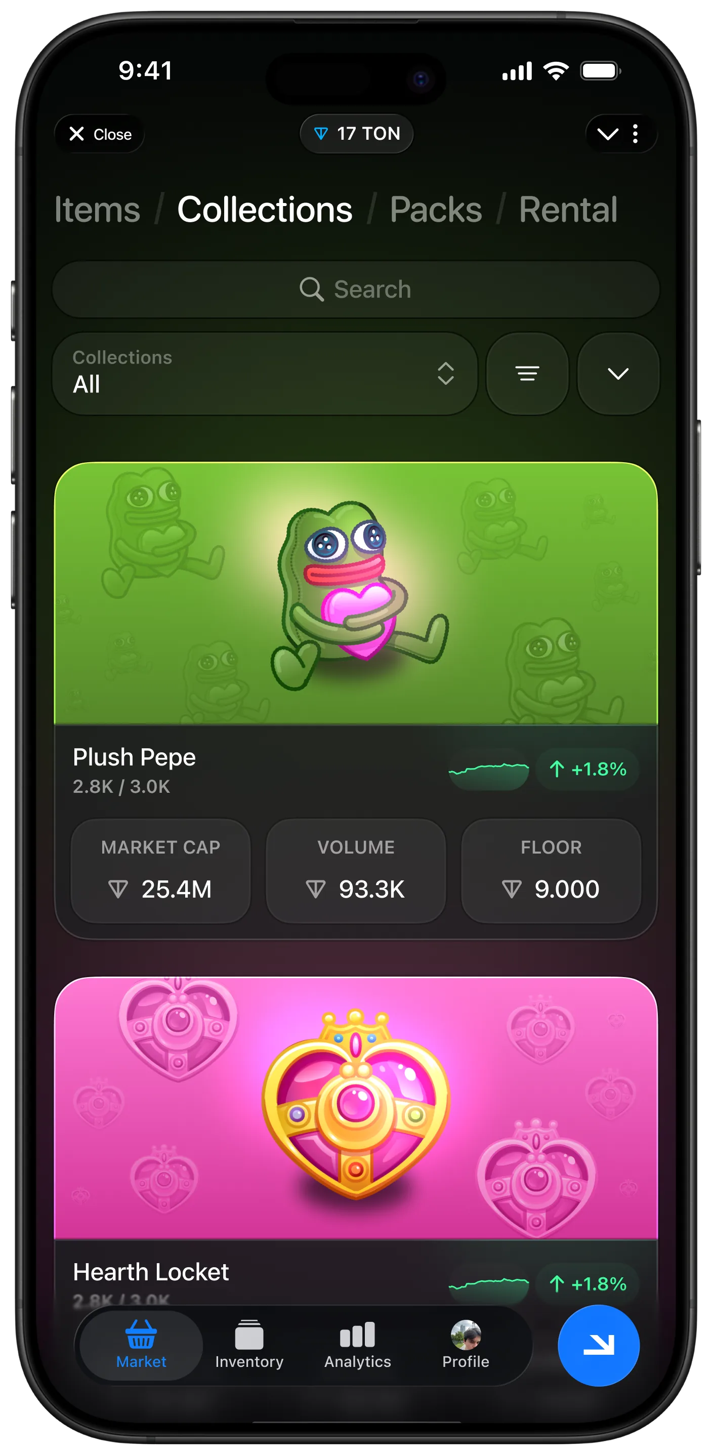
The mechanic I built the product around is one I have kept using since. The interface samples the asset currently in view and lets it light the surrounding surface - background, glow, accent, the temperature of the whole screen. A rarer, richer gift produces a richer screen. The interface is not decorated; it is lit by the thing it is showing.
That does one useful job beyond looking good: it makes the item the brightest thing in the frame at all times. Hierarchy stops being a matter of type scale and becomes a matter of light, which means the trading tooling can stay dense without ever competing for the eye.
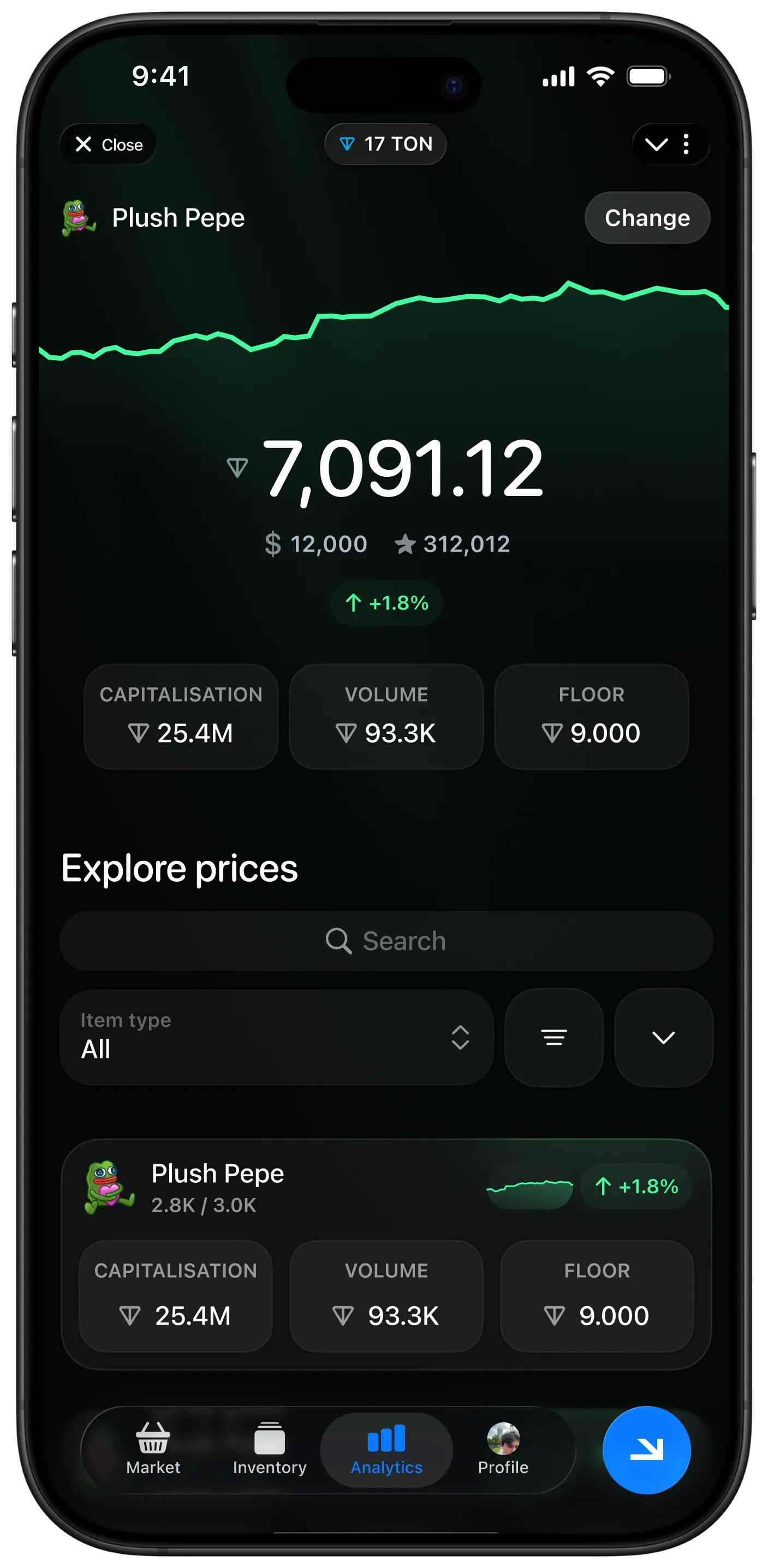
Everything else follows from that decision. Tools are pulled to the edges and summoned rather than displayed. Market data - capitalisation, volume, floor - sits as a compact strip under the asset rather than as its own screen. The P2P flow keeps both sides of a trade visible in one frame, because an offer is a comparison, not a form.
Deep Telegram integration carries the rest. Inline commands let an experienced trader act without opening the app at all, which keeps the interface free to serve the people who are here to look.
My approach
Lead with the asset, not the catalogue
Establish the gift as the primary object on every screen it appears on, and treat browsing, trading and analytics as layers around it.
Build the ambient light system
Derive surface colour, glow and accent from the asset in view, with rules that keep contrast and legibility intact across the whole range of item palettes.
Design the trade as a comparison
Model the P2P offer on the Steam pattern: both bundles side by side, value visible on each side, and a single unambiguous moment of agreement.
Compress the market layer
Reduce capitalisation, volume and floor to a strip that reads at a glance, and keep the full analytics behind the subscription rather than in everyone's way.
Push power use into Telegram
Move repeat trader actions into inline commands, so speed for regulars does not cost clarity for everyone else.
A trading product that still looks like a gallery
The product carries a full P2P trade system, a market data layer and a subscription analytics tier, and the first thing a person sees is still the gift. That is the whole design argument, and ambient light is what makes it hold.
It also gave the product an identity that does not depend on a logo. The screen looks different for every asset, and it looks different because of the asset - which is a harder thing to copy than a colour palette.
Two other products here ran into the same tension from different directions. BBDEX had to keep a multi-chain portfolio legible without turning into a terminal, and Bartly had to keep a two-sided market generous on the side that supplies it. The general version of the argument is in designing for outcomes, not screens, and the constraint a mini app opens under is the subject of onboarding starts long before the app opens.
- Ambient light: the surface is lit by the asset in view
- P2P trades modelled as a two-sided comparison, not a listing
- Market data compressed to a glanceable strip
- Inline Telegram commands for traders who already know what they want
Reflection
Ambient light started as a way to stop the tooling from flattening the items. It turned into the product's signature, and I have been reusing the idea ever since: let the content set the light, and hierarchy mostly solves itself.