
by.studio
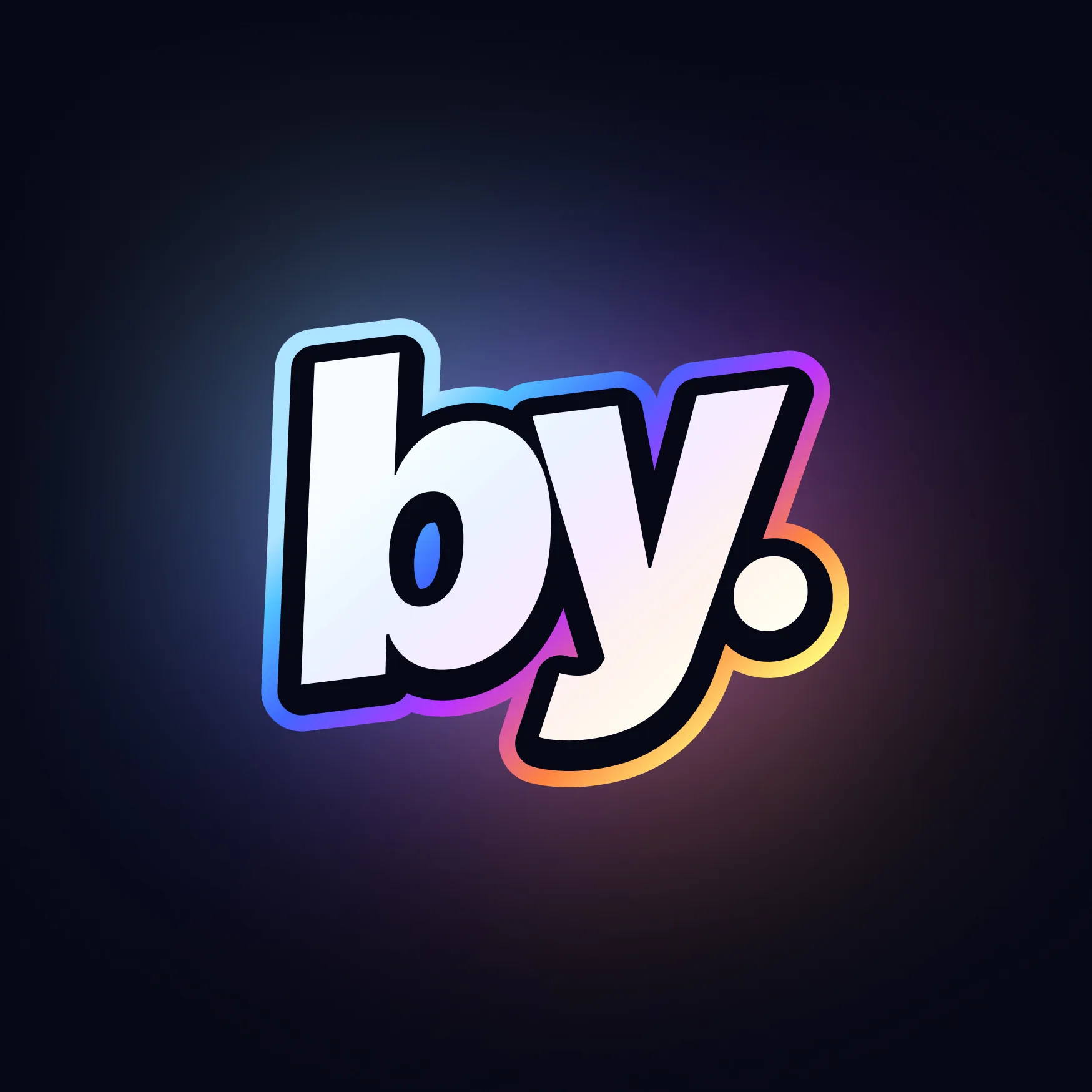
An identity for a studio that kept adding disciplines.
- Studio
- by.studio - my own team
- Size
- Five people, assembled over years of practice
- Scope
- Design, development, launch, infrastructure, security, AI automation, marketing
- My role
- Founder, naming, brand and identity, product direction
Context
by.studio is not a client project. It is the team I put together over years of practice - five people I would pick again, working with the same clients on a standing basis rather than project to project.
Name a studio that has not finished growing
Most studio names describe something: a craft, a material, a founder's surname, a made-up word with a good domain. All of them work on day one and all of them start to lie later. A name that says design is wrong the first time the team ships infrastructure. A name that says digital ages on a schedule.
Adding descriptors is the usual fix, and it just produces a longer version of the same problem. So does inventing a word, which buys availability at the cost of meaning.
The second constraint is the mark. Whatever it is has to hold on a pitch deck, a repository avatar, an invoice, a status page and a chat icon - mostly small, mostly monochrome, and unforgiving of detail.
by. - a preposition, not a word
The name is a preposition with a full stop after it. That is the whole idea. "by" cannot stand alone as a subject; it exists to attach to whatever comes next, which means it never claims a category and has nothing in it to go out of date. It is the credit line - designed by, built by, secured by - cut one word short, and the period closes it so it reads as a mark rather than as a fragment.
Because it is a preposition, it scales by completion instead of by descriptor. by.studio, by.advertising, by.hakowsky. Each one finishes the phrase with what the thing actually is, and the family holds together without a shared suffix or a redrawn logo. A new discipline does not need a new name, only the word that follows the stop.
The name is also the address. by.studio is the studio and the domain in one - no getby, no byhq, no compromise bought at a registrar. The full stop that makes the name work grammatically is the same character that makes it resolve, which is a rare thing to get for free.
The cursor is my own mark, and it belongs here for the same reason the name does. "by." is an attribution, and a cursor is the thing doing the pointing - the author's hand, present in the work. It is the one figurative element allowed in, it carries the identity where the logotype will not fit, and it is mine before it is the studio's.
Colour behaves as light rather than as fill. Deep, near-black surfaces with the mark glowing off them, which keeps the identity confident at the small sizes where a flat two-colour logo goes quiet.

My approach
Look for a function word, not a noun
Rule out anything that names a craft or a category, and search in the part of the language that attaches to things instead of describing them.
Test the name by extending it
Write by.studio, by.advertising and by.hakowsky before committing, because a name that only works once is a name with a ceiling.
Make the name and the domain the same object
Treat the address as part of the naming brief rather than as a problem to solve afterwards.
Design for the smallest surface first
Resolve the mark at avatar scale before anything else, because that is where it is seen most and forgiven least.
Write the rules, not just the files
Define spacing, contrast behaviour and pairing so a team of five produces work that reads as one studio.

A name that survived the studio changing
The name was chosen when by.studio did design. It still fits now that the same team ships development, hosting, security, pentesting, AI automation and marketing - which is the only real test a studio name gets. Nothing had to be renamed, because nothing was ever claimed.
Working with clients on a standing basis put a different demand on the system than a portfolio brand does: it appears in places nobody art directs. Status pages, invoices, commit histories. It had to be robust enough to be used correctly by people who are not thinking about branding that day.
boostlab is the other identity in this portfolio, built on the opposite problem: a promise so broad it turns vague in a logo. What rules around a mark actually have to do, once several people depend on them, is in a design system is a decision system. And Axis is what this team ships for itself when nobody is watching.
- A preposition for a name, so it describes nothing and dates nowhere
- Scales by completion: by.studio, by.advertising, by.hakowsky
- Name and domain are the same string, full stop included
- The cursor is my personal mark, carried into the studio's identity
Reflection
Branding your own studio is the hardest version of the job, because the brief keeps moving and you are the one moving it. The name held because it never described what we do - it only says who it was done by.