
boostlab
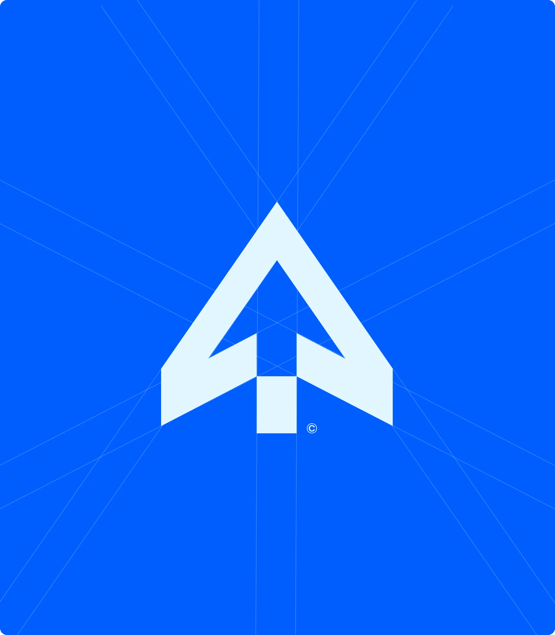
Direction built into the geometry, not stated on top of it.
- Studio
- boostlab - international product studio
- Promise
- We create, we grow, you earn
- Scope
- From first investment to break-even and new locations
- My role
- Brand and identity, design system
Context
boostlab moves businesses from point A to point B, wherever they happen to be standing. Early startup and first investment at one end, break-even and opening the next location at the other, and everything a company has to survive in between.
How do you draw movement without drawing an arrow
Growth is the most crowded metaphor in business branding. Upward arrows, ascending bars, rockets - all instantly legible and all instantly forgettable, because every studio in the category has already used them.
An international studio has a second problem. The mark travels across languages and markets where a clever wordmark stops working, so recognition has to survive without the name being readable.
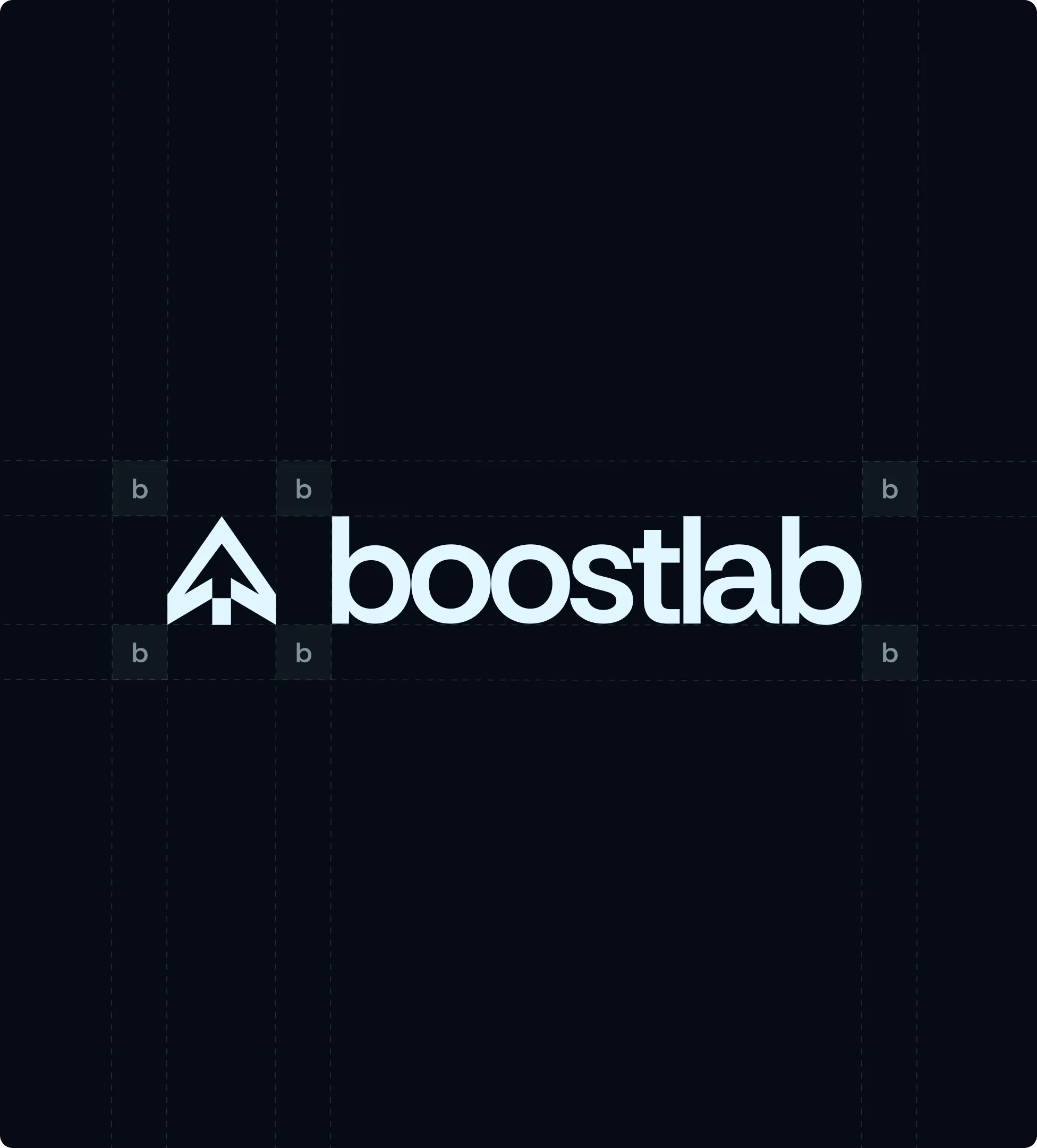
And it has to compress. The same identity appears as a full studio signature on a proposal and as a favicon in a browser tab. Anything that depends on internal detail loses the argument at 16 pixels.
Direction built into the geometry, not stated on top of it
The mark is a single constructed form with direction inside its geometry. It reads as forward motion without an arrow being present, which means it says the thing the studio promises without joining the category's visual queue.
Everything is drawn on a grid, and the grid stays visible in the brand material. That is not decoration: structured, scalable and human-centred is the studio's actual working principle, and showing the construction is the cheapest honest way to say it.
The system is monochrome-resilient by design. The mark is resolved first as a silhouette, so it holds in one colour, in reverse, and at favicon scale. Colour is applied afterwards as energy rather than as identification.
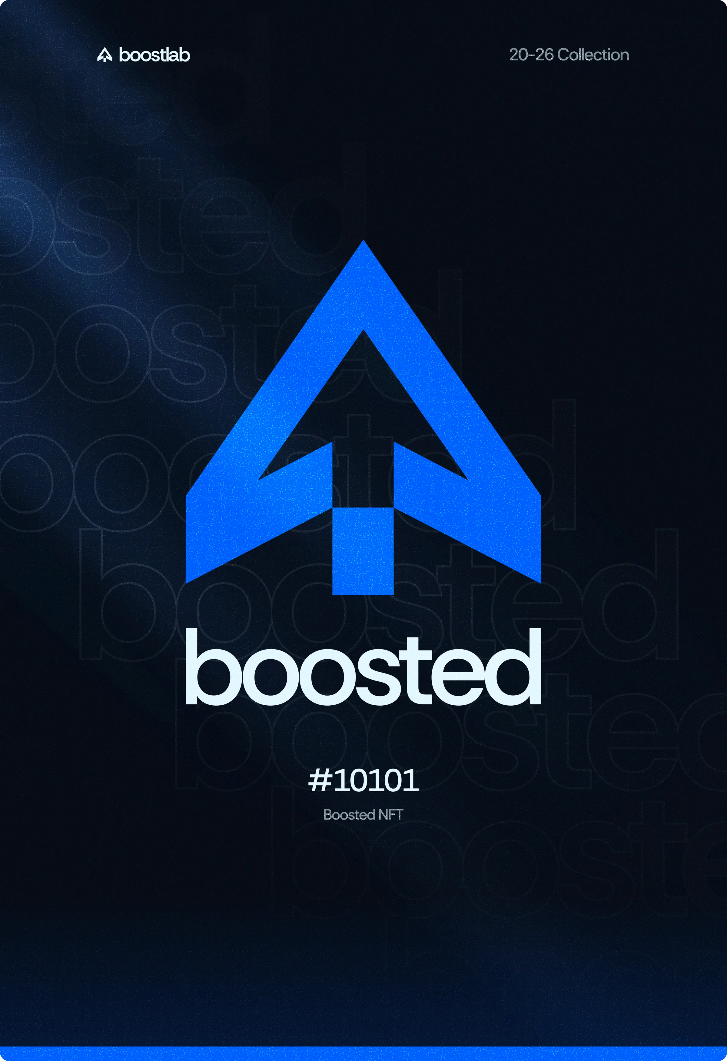
The same form scales into product surfaces without redrawing. It is the app icon for boostlab's own tools, the anchor of the collectible series, and the signature on client work, which keeps a studio that touches many industries reading as one operation.
My approach
Reject the category metaphor
Rule out arrows, bars and rockets first, so the search has to find direction somewhere less obvious.
Resolve the silhouette before the colour
Build the mark to work in one colour at small size, then apply colour as energy rather than as the thing that makes it recognisable.
Keep the construction visible
Show the grid in the brand material, because structured and scalable is a claim the studio makes and should be able to demonstrate.
Design for the widest range of surfaces
Prove the mark from favicon through app icon to full studio signature before calling it finished.
One form that carries a studio across markets
The identity holds from a browser tab to a poster without changing construction, which matters for a studio whose work spans industries and countries. Recognition never depends on reading the name.
It also scaled into product. The same geometry is the icon for the studio's internal tools and the anchor of a collectible series, so the brand is not a layer applied to the work but the same object appearing in it.
Axis is the clearest case of the geometry leaving the brand and becoming product: the studio's own tool, built for the studio. by.studio is the other identity here, solving the reverse problem - a name that had to describe nothing at all. What a set of rules has to do once a team depends on it is in a design system is a decision system.
- Direction expressed through geometry rather than an arrow
- Silhouette resolved before colour, so the mark survives monochrome
- Construction grid kept visible as evidence of the working principle
- One form reused from favicon to app icon to studio signature
Reflection
Every studio in this category says it makes businesses grow. The only part of that claim a logo can actually carry is the direction, so I put it in the construction and left the promise to the work.